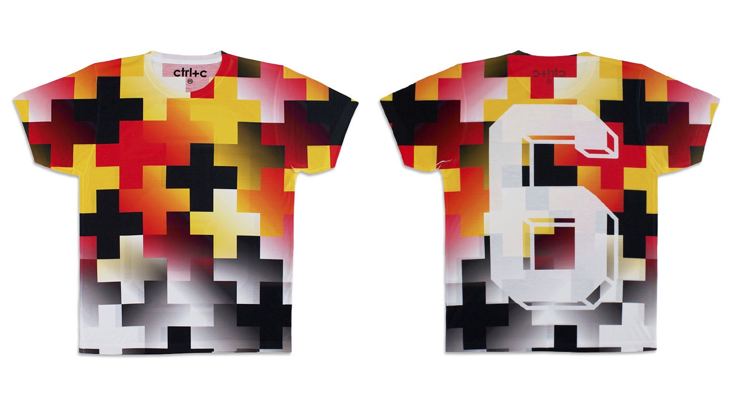
Challenging Borussia Dortmund jerseys as the official uniform of the soccer hipster
Short of being a full kit wanker, you can never have too much soccer paraphernalia or display your love of the game too publicly. That’s why the debut ‘pre-season’ collection of T-shirts from the British label ctrl+c, which draws inspiration from the gradients and geometric prints of soccer jerseys from the 1980s and ’90s, caught our attention. We asked Conall McAteer and Jack Sharples, ctrl+c’s co-founders, to talk us through the inspiration behind a few of the t-shirts in their 11-piece squad-cum-collection.
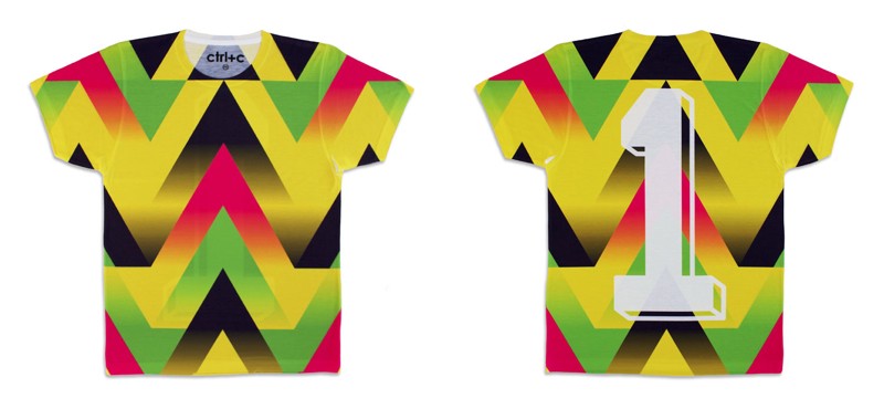
GK / 1 — Jorge Campos 1994
“We loved the way Jorge Campos (Mexico’s goalkeeper in the 1994 and 1998 World Cups) designed his own kits to wear on match-day. GK is our celebration of all things Campos: a man who successfully expressed himself on the pitch and also had a creative output with which he was synonymous.”
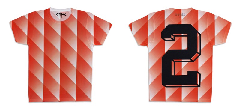
RB / 2 — Holland 1988
“You can’t make an orange shirt without referencing the team that made the colour their own. For us, RB was all about producing a clean graphic that accentuated the hue associated with the Dutch team that became synonymous with the ‘beautiful game’.”
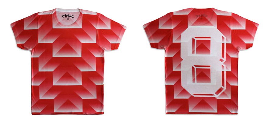
CM / 8 — CCCP (Russia) 1998
“Adidas released several gradient iterations and colour-ways of this geometric print. This shirt uses one of the first versions of that print. It’s one of the designs from that period that really resonated with us so we had to feature it in the ‘pre-season’ collection.”
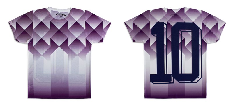
ST / 10 — Fiorentina (Away) 1992
“There were a few variations of the half shirt pattern in 90s football kits, but this purple Fiorentina number was definitely one of our favourites. We couldn’t resist keeping the original colour combination for our own interpretation.”
You can see the entirety of the ‘pre-season’ collection on ctrl+c’s website
