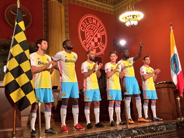
The Columbus Crew unveil MLS’s ugliest kit for 2016
February 10, 2016

Remember a couple hours ago when I implied that NYCFC’s new kit wasn’t all that good looking? Well, I take it back. It’s gorgeous compared to the abomination the Columbus Crew just unveiled.
The kit is based on Columbus’ flag, which itself looks like the product of crappy MS Paint artistry.
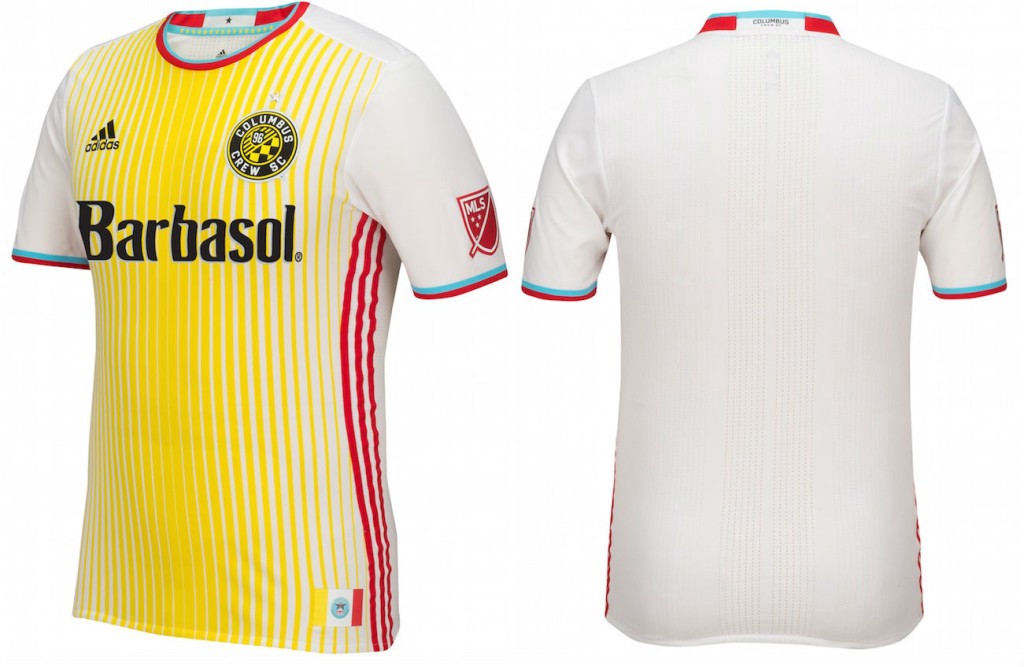
The photo above gives a good overall view on the ocular assault this kit presents, but to fully appreciate the nuance of its horror, you need to see the shirt in greater detail.

I’m comfortable branding this as an ugly kit. That said, ugly kits are great (as long as they’re not being worn by your club). People talk about ugly kits way more than they talk about average or even good ones.
This will probably be Columbus’ most talked about kit ever. Some people will like it, some will wear it ironically, and at the end of the day it will serve its purpose: to clothe the players, make them identifiable, and sell some shaving cream.
