To maximize soccer’s global reach, mascot design is simultaneously becoming more calculated and daring
By Daniel Nyari | Photo via Équipe de France de Football
[I]t’s mascot season. The 2015 Copa América and Euro 2016 both unveiled their mascots last week. Earlier this year, Canada also revealed the mascot for the 2015 Women’s World Cup. All three tournaments are still some time away but early reactions have poured in on social media, judging their mascots’ strengths and failings. At a time when design and illustration are becoming more integrated in sports marketing and digital technology is allowing for more innovation and experimentation, these mascots represent three different approaches to design. They are also surprisingly good indicators of where design stands relative to soccer’s continuing global reach.
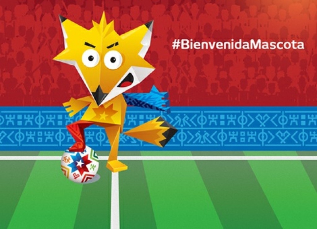
The traditional role of the mascot is to symbolize and reflect local identity. For the 2015 Copa América, Chile’s mascot is a young Culpeo fox, an animal native to Latin America. This is Chile’s second international tournament with an official mascot. The mascot for the 1991 Copa América was simply a drawing of a huaso (horseman) in the colors of the Chilean flag.
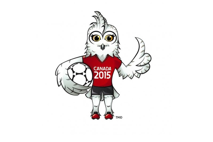
As the host of the 2015 World Cup, Canada’s mascot is a Great White Owl named Shuéme. Like Chile’s Culpeo fox, Shuéme upholds the tradition of mascots overtly representing their nation’s heritage and wildlife.
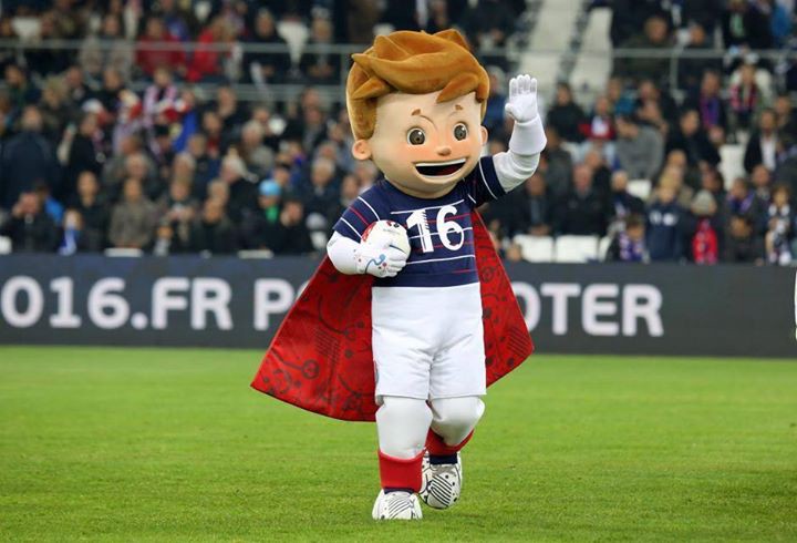
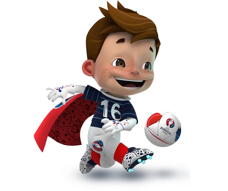
France, the host of Euro 2016, went against this tradition and unveiled an as-of-yet unnamed boy in a cape as its mascot. France’s previous tournament mascots, 1984’s Péno and 1998’s Footix, were both Gallic roosters, France’s national symbol.
• • •
[M]ascot design was traditionally characterized by a hand-drawn, outlined, and two-dimensional aesthetic, not unlike what you’d see in television cartoons or comic books. That makes sense when you consider that mascots are made to appeal to children. France 98’s Footix marked the end of a 32-year period of traditional character design as mascot design began to enter the three dimensional realm. Digital technology allowed for new ways to create mascots and created different platforms on which to present them. South Korea and Japan’s mascots for the 2002 World Cup, Ato, Kaz, and Nic, were the first to be completely rendered digitally.
The computer age has allowed mascots to play a more prominent role in soccer’s marketing push. Soccer is no longer just a global game but a global brand. For much of its history, soccer marketing focused on local markets; crossover appeal was restricted to international tournaments and the occasional friendly match. Now, with lucrative TV deals and the Internet, football clubs in England can appeal to target audiences in China and North America. Soccer’s movers and shakers are doing everything they can to ensure you get this message. The digitization of brand assets is one way to do that. While mascot design has been slow to move into the digital age, we are now starting to see that final push. Digital tools are being used to create characters and their styles are being influenced by this technological revolution. The three recently revealed tournament mascots represent the successes, pitfalls, and possibilities of this shift.
• • •
[O]ver the past decade, design trends have been moving in the direction of universality. Designers are creating market-ready imagery that represents the individual values of brands yet remain accessible to the global market. Shuéme’s unveiling featured this increasingly common rhetoric: “…a tribute to Canada’s status as a bilingual nation, embraces the expansive and inclusive soul of Canada as a multicultural country…colours that symbolise peace and fair play, and with stylish hair that exudes self-confidence and pride, Shuéme’s flowing contours suggest grace under pressure, while her wings and tail ensure precise control and agility….Shuéme is the perfect embodiment of the values and qualities of women’s football and she is certain to be a big hit with fans of all ages during the year ahead….The importance of such a strong visual asset as part of the tournament’s overall brand identity cannot be overstated and Shuéme, whose proud outlook incorporates spirit, grace and power, is a great recruit to the FIFA Women’s World Cup Canada 2015™ team.”
Canada’s announcement is indicative of how Shuéme’s identity was carefully crafted to advance the tournament’s message. It covers all the bases, almost paradoxically so. Appeals to children, but also to adults. Very Canadian but also extremely universal. Fast-moving and ready for action but also peaceful in her disposition. These contradictions and loose interpretations of national values will probably reappear in press releases for future mascots and many other brands. Mascots are now imbued with far more meaning and purpose than their predecessors. They are far more aggressively tied down to their brands. In order to meet the requirements of a global audience, character design has become more focused and strategic. These requirements have allowed the actual design of mascots to become more adventurous
In order to meet the requirements of a global audience, character design has become more focused and strategic. These requirements have allowed the actual design of mascots to become more adventurous
The Euro 2016 mascot represents the biggest departure from the old: A fully CGI mascot. Previous mascots, like Germany 2006’s Goleo, have been rendered digitally only to be presented as a flat illustrations. France’s Euro 2016 mascot is also the first to be unveiled in a 6-second Vine. While many mascots before France’s were designed to appeal to children and some looked adolescent, this character is meant to look just like the kids for whom it is designed. More telling is the decision to bring the mascot into reality not by contextualizing him in a potentially uncomfortable costume but by referencing an archetype the audience will probably be familiar with from popular animated feature films. This design wouldn’t look out of place in a film like How To Train Your Dragon, The Incredibles, or Big Hero 6. It even has a trendy haircut!
The polygonal forms of Chile’s Culpeo fox represent a bit of a stumble. They are the outgrowth of geometric art, which has become popular as digital technology has encouraged us to see life through a virtual lens in which the world is made up of numbers and geometric shapes. Chile’s mascot is a piece of polygonal art, a sub-category of geometric art characterized by the translation of planes and shapes into dark and light triangles and rhombi. These triangles are combined in asymmetrical ways to create the illusion of reality. Polygonal art translates subjects literally, maintaining their proportions and emphasizing readability. It resembles the Cubist language in its distortion of perspective and convergence of planes but shows a greater desire to make its subjects readable. Polygonal art is created by tracing objects or using algorithms to translate photographs. Other methods usually lead to chaotic results; triangles and rhombi get placed in explosive color combinations just for the sake of flash. If art is a series of questions asked of the past and present, we have not yet established what question polygonal art asks.
Design is about function and problem solving. It answers a question or provides a roadmap that leads to that the answer. Polygonal art, on the other hand, is largely experimental. It isn’t a tool to answer a question that can be answered by design. Chile’s mascot achieves mixed results. It presents a clear image of a fox, derived from our collective knowledge of what an anthropomorphized cartoon animal looks like and the generally recognizable traits of a fox. However, the character doesn’t feel grounded or suggest how it would look in a different pose. Overall, there is no sense of movement. If you remove the fox’s gradients, it is reduced to an even flatter and less dynamic form. Gradients are largely a crutch here; they hint at the existence of a third dimension but fail to give the fox’s form a much-needed functionality. Furthermore, Chile’s mascot does not manage to convey a sense of dynamism, a value inherent to soccer. By comparison, Shuéme is instantly recognizable as a dynamic and free-flowing figure.
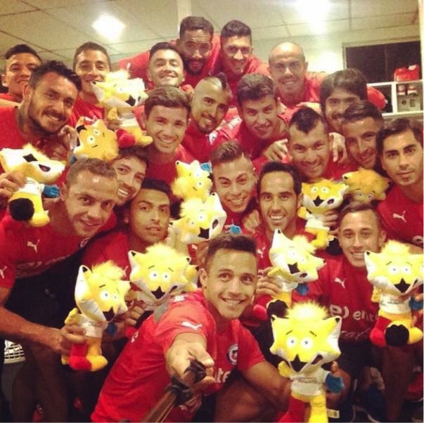
As a style, polygonal art is better suited to large, abstract endeavours or logos than it is to character design. Chile’s mascot is an attempt to compartmentalize the polygonal process but, in doing so, it strips away what can be interesting about polygonal art and reveals its main flaws. Consider the stuffed animal version of the Culpeo fox used at the mascot’s unveiling. While it retains some of the character’s angular awkwardness, it looks more fully realized because it’s taken out of its polygonal context. The polygonal aesthetic seems to only exist in the digital realm. The stuffed animal is not a part of Picasso’s world of flattened perspective but it is also not comfortable in the virtual-but-three-dimensional space traditional character design alludes to. There is not yet a space in which we allow polygonal art to show us how it can function within design.
If France’s mascot represents a successful character design and possibly the future of mascots and Culpeo represents a stumble along the way, Shuéme is the bridge between the two. Simply put, Canada’s mascot is the digitization of a traditional rendering of a character. Every mascot since 2002 has been presented and used in this manner with exception of the heavily marketed live Goleo VI for Germany 2006. Shuéme retains the familiarity of traditional character design but adds the sheen of subtle gradients and flexibility of vector graphics. This will probably remain the industry standard for the time being.
The different approaches to character design that these three mascots represent emerged in a small timeframe. That one design may be more successful than the others is beside the point. Rather, these mascots highlight what an interesting time this is for soccer marketing, particularly when it comes to the use of art and design. The idea of a digital information age is certainly not a novel one in a general sense but it is in the world of football. The sport is almost intrinsically rooted in the mode of global capital with an ever-expanding and inexorable reach. Up to this point, the amount of art, design, and illustration used in the promotion of football has been uncannily small relative to the sport’s popularity. Yet media outlets, clubs, and ad agencies are increasingly involved in the creation of design-conscious soccer content and content with artistic value. Today, a quick Google search for “football, soccer, design, art” will yield far more results (if you exclude the dull stock art) than it did just a couple of years ago. Exciting times lay ahead.

Daniel Nyari is a NYC-based illustrator, designer and art director whose clients include MLS, ESPN, Microsoft, GQ, American Express, and Wired. He tweets under the handle @danielnyari.
